Despite North Carolina slowly injuring itself by trying to eliminate oil, coal, and natural gas as energy sources, the scientific basis for “net zero” (the complete elimination of fossil-fuel usage) is based more on “general agreement” than hard data. Climate scientists nevertheless sound optimistic about the progress that is being made in destroying society’s carbon-energy base.
There are of course criticisms of the idea of a carbon-dioxide-induced apocalypse, largely supported as it is by general circulation (i.e. whole-earth) planetary models (GCMs). There are too many different GCMs all with too many free parameters (aka “fudge factors”), as well as wildly divergent readings of historical climate records: Are violent climate events really more frequent, and how does weather actually relate to climate?
The popular press cries “crisis,” but the data are not so clear. The looming economic costs of a “net zero” target are leading to some political pullback. Nevertheless. the recent jury acquittal in the UK of nine “Extinction Rebellion” vandals shows that passionate belief in the imminent dangers of CO2 is not limited to activists.
Climate science is complicated, but the key question is simple. The climate does seem to be getting warmer, but are we responsible? Does the level of atmospheric carbon dioxide have a major effect on the temperature of the earth? The standard answer is “yes, of course.” But in fact there are good reasons for doubt.
Popular accounts of the “climate crisis” rarely show quantitative data. Yet there are widely available graphs that anyone can understand. Here are three graphs which suggest that the answer to the question is probably “no.” It is likely that beyond a certain point, carbon dioxide has a relatively minor effect on planetary temperature.
The very long-term historical record
This graph is controversial, simply because estimates of CO2 concentration and temperature before thermometers were widely available — i.e. through 99.99% of the earths’ history — must be estimated indirectly, by proxies such as ice cores, tree rings and isotope measurements.
If this graph of global temperature and CO2 concentration over the past 600 million years is approximately valid, it shows two things:
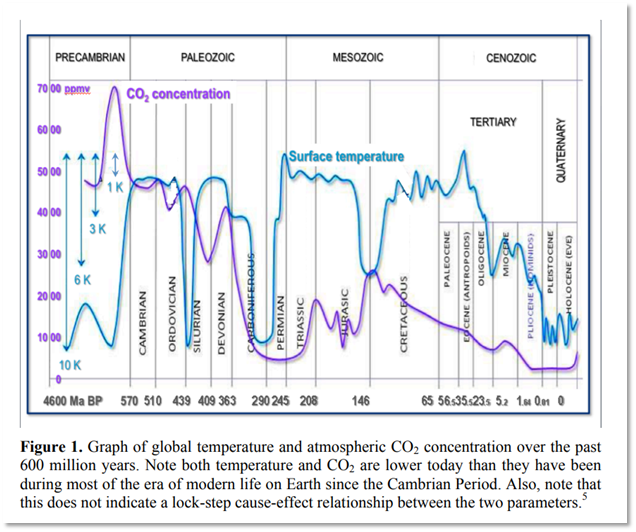
- According to one expert, and as the far right point on the graph shows, “the carbon dioxide content of the atmosphere today is the lowest in Earth history except for a period just following the end-Permian extinction event and very early in the Phanerozoic (that is, around 550 million years ago). [emphasis added]”
- There is no correlation between the CO2 level and global temperature: when CO2 is high, temperature may be low, and vice versa.
The second conclusion is less certain than the first. But, certainly vertebrate life has flourished on earth at CO2 concentrations much higher than today’s.
The long-term historical record
The CO2-temperature correlation is much clearer over a shorter time scale, 800,000 years, as in the next graph (which is not at all controversial). The graph shows temperature (red line) and four estimates of atmospheric CO2 from the EPICA Antarctic ice dome studies across an 800,000-year time period.
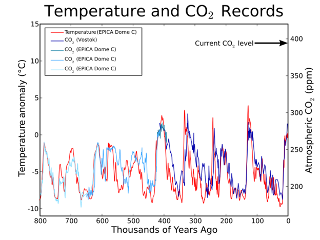
The two main conclusions to be drawn from this graph are:
- At this relatively short time scale, CO2 concentration and temperature are strongly correlated: CO2 and temperature go up and down together.
- But CO2 increases reliably lag behind (by 300-800 years) temperature increases, showing that the CO2 changes are caused by the temperature increases, rather than the reverse. Reason: As oceans heat up, gases, including CO2, are expelled. When they cool, atmospheric CO2 is absorbed; warm water can hold less dissolved gas than cool (most planetary CO2 is stored in the oceans)
There are arguments, based on positive feedback, that even though ocean heating precedes rather than follows CO2 increase, the effective causation is opposite: CO2 causes heating, not the reverse. But the simplest conclusion is that major changes in atmospheric CO2 are caused by changes in planetary temperature, not the other way round.
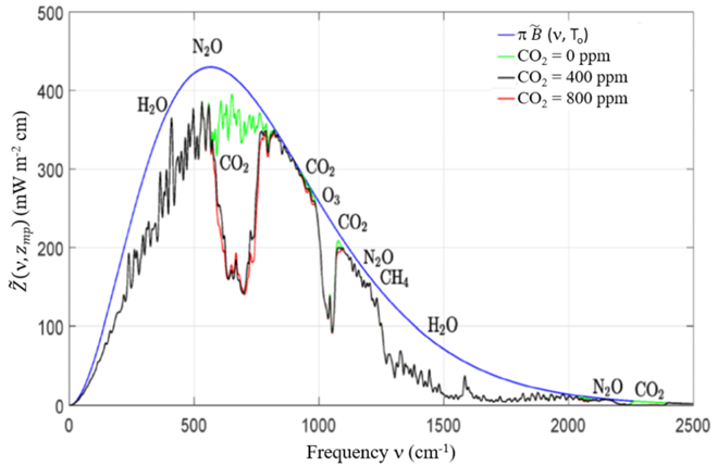
Physics
The final graph is from a recent long paper by two physicists, William Wijngaarden (York University, Toronto) and William Happer (Princeton). The article just considers the basic physics of the greenhouse effect, given the physical properties of air and the handful of low-concentration greenhouse gases (CO2, nitrous oxide and methane) that it contains.
The blue bell-shaped curve shows the amount of solar energy flux (at different wavelengths, x-axis) re-radiated to space from an earth with no atmosphere. (Most is in the infrared region 400-1000 or so.) The green line is the flux with an atmosphere with no CO2 but with all other greenhouse gases at their current concentrations. The black line is for all greenhouse gases, CO2 included, at their current concentrations. The red line is for twice the current concentration of CO2 (400 to 800 ppm) but with all the other greenhouse gases unchanged.
At 400 ppm CO2 does have a greenhouse effect: radiated energy is reduced in the 500-700 frequency range. But an increase to 800 ppm has almost no additional effect: the black and red lines are almost the same. Doubling the standard concentration of CO2 from 400 to 800 ppm has almost no additional greenhouse effect.
Conclusion
Taken together, these three bits of data should make anyone doubt that further increases in CO2 pose any kind of environmental threat. The earth may be warming, but it is unlikely that CO2 is responsible. There is almost no chance that these changes are life threatening or even — granted that human activity is probably not responsible — that warming will continue indefinitely. At the very least, let’s all relax a bit. There probably is no “climate crisis.”